3D Puff Embroidery Fonts: How to Choose the Right Font for Bold Stitching
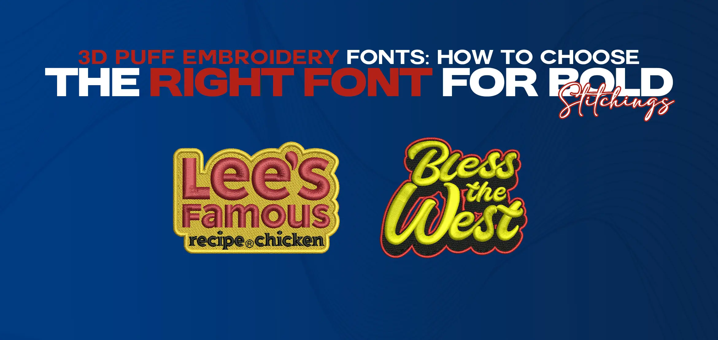
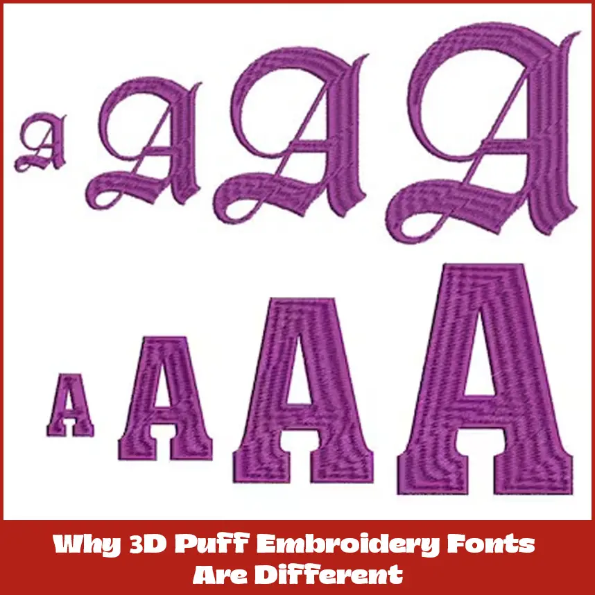
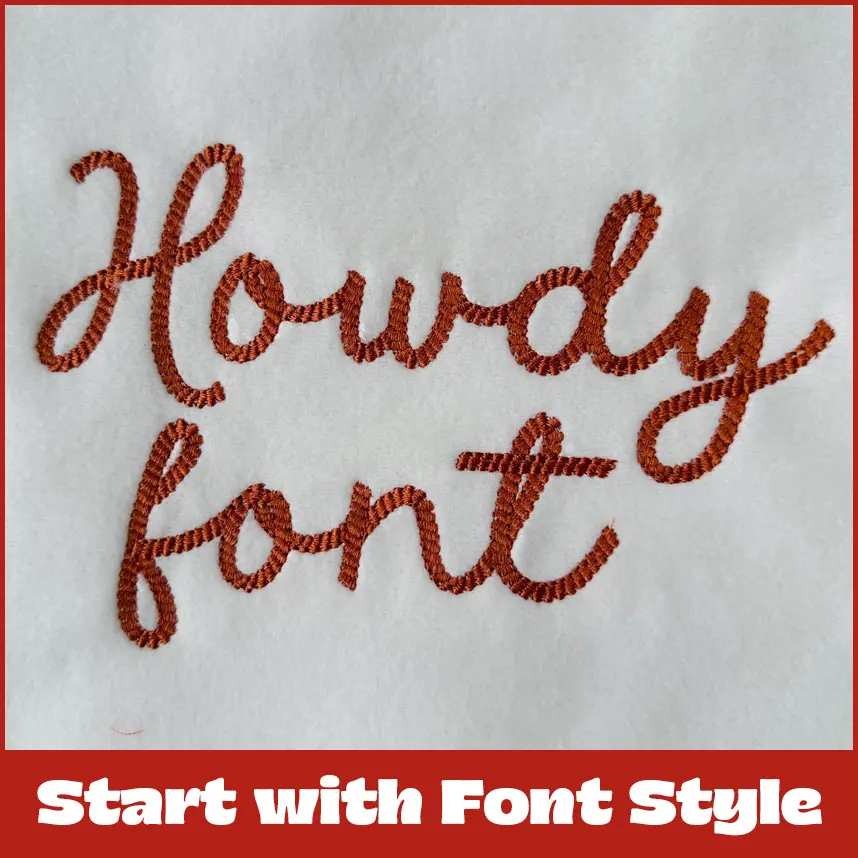
When you are getting into 3D puff embroidery, picking the right font can make or break your design. The raised, bold look of 3D puff embroidery fonts demands more than just grabbing any typeface that looks cool. You are creating something that pops off the fabric. Think of hats, jackets, and bags with that eye-catching, textured vibe. We have done countless projects where the font choice turned from a good design into a showstopper. So, how to choose the perfect font for 3D Puff embroidery? Let’s break it down with real-time tips and tricks. 3D Puff embroidery isn’t your standard flat stitching. The foam underneath gives letters a raised, almost sculpted look, which is awesome but tricky. Not every font plays nice with that extra dimension. Thin and delicate fonts might collapse when puffed up. And overly complex fonts with tiny details might not produce the clean stitches. The best 3D Puff embroidery fonts strike a bold balance to hold the foam’s shape. A font that’s too skinny or intricate, such as wispy cursive, often ends up looking like it’s struggling to hold itself together. When you’re browsing fonts for 3D puff embroidery, go for ones with some heft. Bold, rounded, or blocky fonts are your friends here. The foam needs room to expand, and a thicker letter gives it space to shine without distorting.05 Picture a font like Impact or a beefy sans-serif like Bebas Neue. These have the guts to stand tall in 3D. Cursive fonts can work, but they’re pickier. If you’re set on a script, choose one with thicker strokes and avoid anything too loopy or fine. Font size is a big deal in 3D puff embroidery. Too small, and the foam can’t do its job. The letters just look flat or uneven. Too big, and you’re eating up fabric real estate, plus the stitching might pucker. A good rule of thumb is to aim for letters at least 0.25 inches tall, though 0.5 inches or more is ideal for that bold, raised effect. Not all fonts are embroidery-friendly, especially for a 3D puff. Before you commit, test how the font digitizes. Some fonts look great on a screen but turn into a problamatic when stitched. At DigitizingUSA, we always run a test stitch-out to catch issues like tight corners or thin lines that don’t puff up right. Software like Wilcom or Hatch can help you preview how a font will stitch, but nothing beats seeing it on fabric. Your font should match the project’s personality. Kids’ clothing line might call for a playful, rounded font like Comic Sans. A sports team logo needs something tough and angular, like a bold serif. For a high-end brand, a clean, modern sans-serif can scream sophistication without being stuffy. The fabric you’re stitching on significantly influences the outcome.. Stretchy knits, like those on hoodies, need fonts with enough weight to avoid distortion. Thicker fabrics, like canvas bags, can handle more intricate designs but still need bold fonts to pop. The type of foam matters too; thicker foam demands a font with wider strokes to avoid gaps or tearing. Always match your font to the material and foam thickness. 3D puff embroidery fonts already have a lot of personality, so don’t go wild with extra effects like shadows or outlines. Keep it clean, let the puff effect stand out.. A slight curve or slant can add style without overcomplicating things if you want some flair. Go bold: Choose thick, sturdy fonts like sans-serifs or chunky serifs. Size it right: Aim for at least 0.25 inches, preferably 0.5 inches or more. Test it out: Always do a stitch-out to catch issues early. Match the vibe: Pick a font that fits the project’s personality. Mind the fabric: Ensure the font suits the material and foam type. At DigitizingUSA, we’ve got a library of 3D puff embroidery fonts ready to go, plus custom digitizing services to make your designs pop. Whether you’re stitching for a small business or a big event, we can help you nail the perfect font. Choosing the right 3D puff embroidery font isn’t just about aesthetics. It’s about making sure your design looks as good on fabric as it does in your head. Take your time, test your options, and don’t be afraid to keep it simple. A bold, well-chosen font can turn a basic project into something people can’t stop talking about. Ready to get stitching? Hit us up at DigitizingUSA, and let’s make your next design a standout.Why 3D Puff Embroidery Fonts Are Different
Start with Font Style
Size Matters
Test for Stitchability
Match the Font to the Vibe
Watch Out for Fabric and Foam
Don’t Exaggerate the Effects
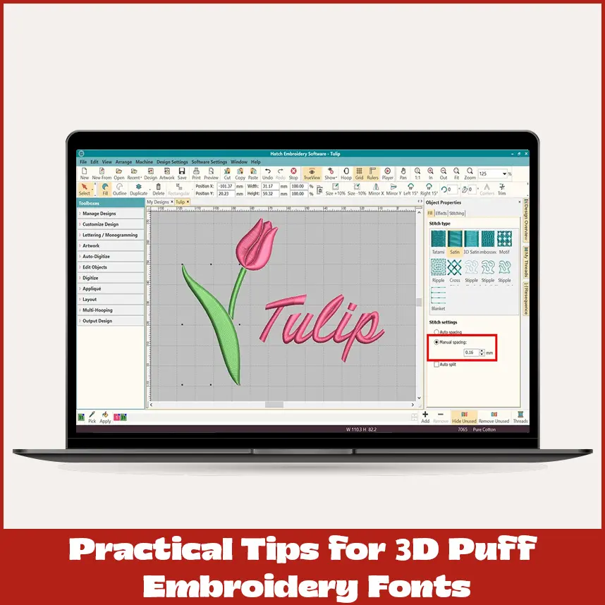
Practical Tips for 3D Puff Embroidery Fonts
Final Thoughts
